Recapped design 0-1
A simple place to store the things you don't want to forget, designed in three weeks.
recapped.com.au- Role:
- Senior Product Designer at Go To Apps
- Client:
- Go To Apps (in-house product)
- Scope:
- Product structure, branding, design system, web app design, landing page and QA
- Industry:
- Consumer web app
- Completed:
- April 2026
In Short
Recapped started with a simple idea from Go To Apps' managing director: a place to keep track of his daughters' toys. As the sole designer, I had three weeks to turn a creative brainstorm into a small, calm web app. It has a fixed data structure that keeps collections simple, personal touches in colour and emoji, a brand built with Sean, and a design system ready for future features. Recapped is live.
Overview
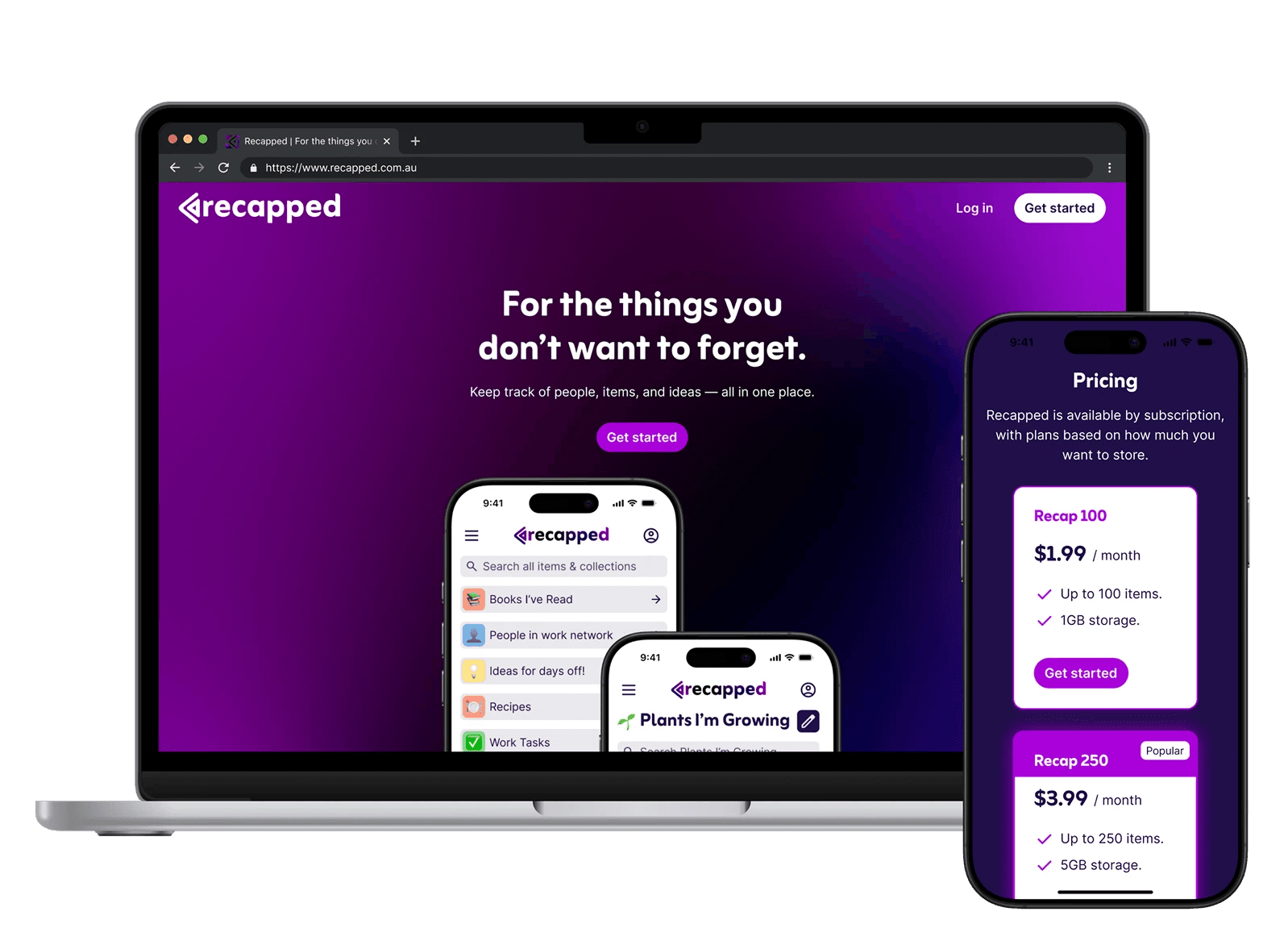
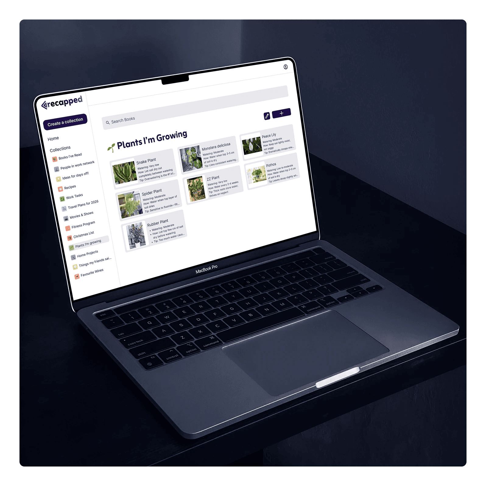
Recapped is a Go To Apps product, a web app for storing the things you don't want to forget. It began as Sean's idea, a simple way to note down the names of his daughters' toys. He could see that the same structure would work for almost anything, from books you've read to vintage comics.
I was the only designer, working from the first concept. I researched competitors, helped shape the concept and the name, wrote responsive wireframes and user flows, created the brand and the design system, designed the screens and a landing page, and ran QA once the developer had built it.
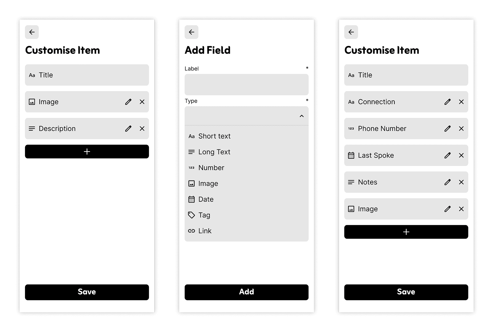
From brainstorm to SLC
Sean gave me a brainstorm of creative notes with broader features and capabilities than a first version could hold. One idea was letting people define their own data structure for each collection. We both wanted to see it. We cut it because it needed a whole extra set of screens and a more complex database, and we wanted a first version we could deliver in three weeks. It took us a little while to get on the same page about what the first version should be.
I aimed for an SLC: Simple, Lovable and Complete. That means a few features, with each one finished and pleasant to use. I pitched a product structure that kept features to a minimum, and Sean gave his input and approved it.
Research
I looked at inventory apps to see how they handle collections, and at reading list apps and other collector apps. Many of them let people customise the data structure. We decided a simple, fixed structure was the better choice for the first version.
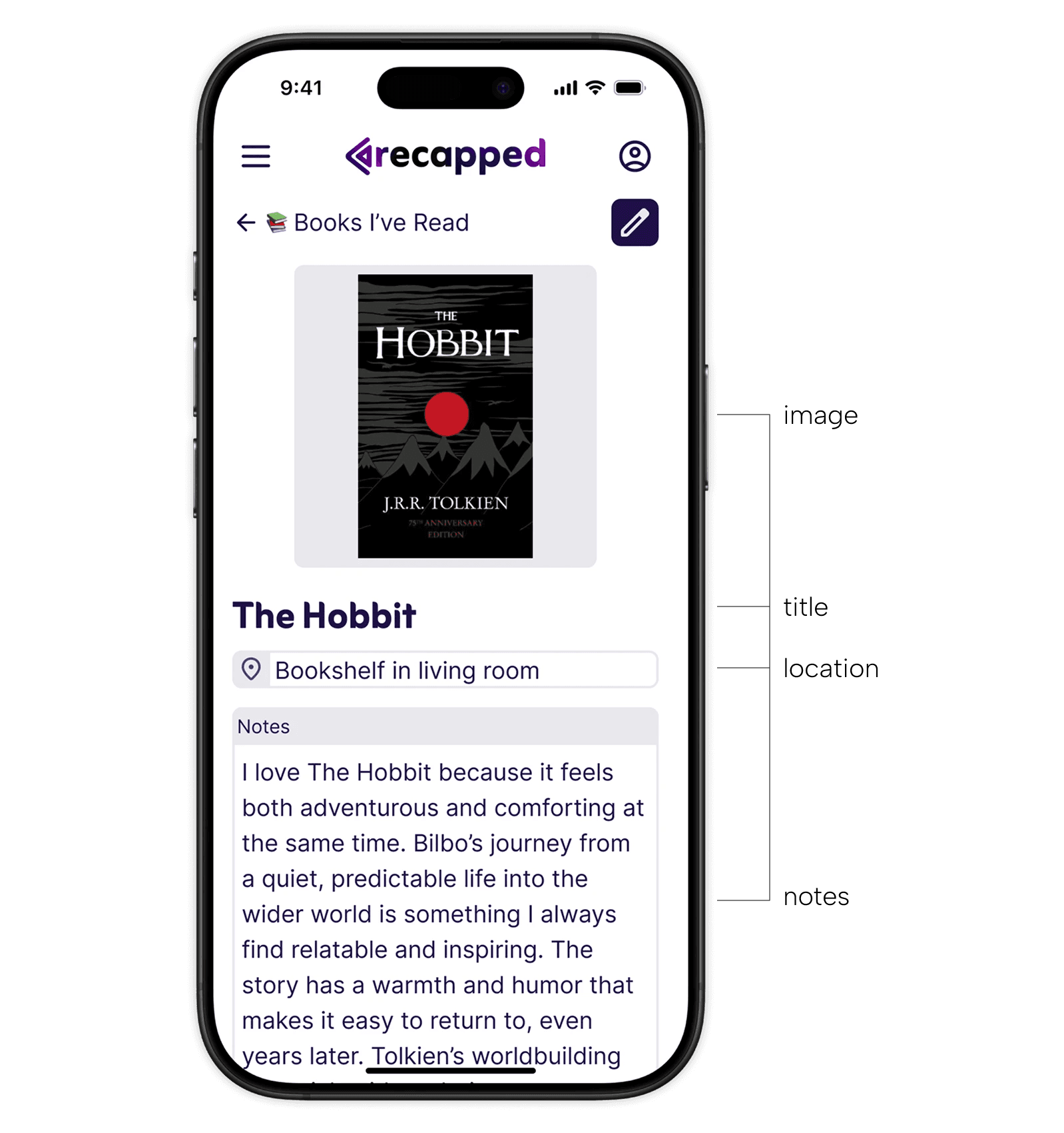
Every item has a title, plus optional notes, an image and a location, such as the shelf it lives on. Any collection whose items fit that structure works, whether it's books, toys or comics.
Personal, within limits
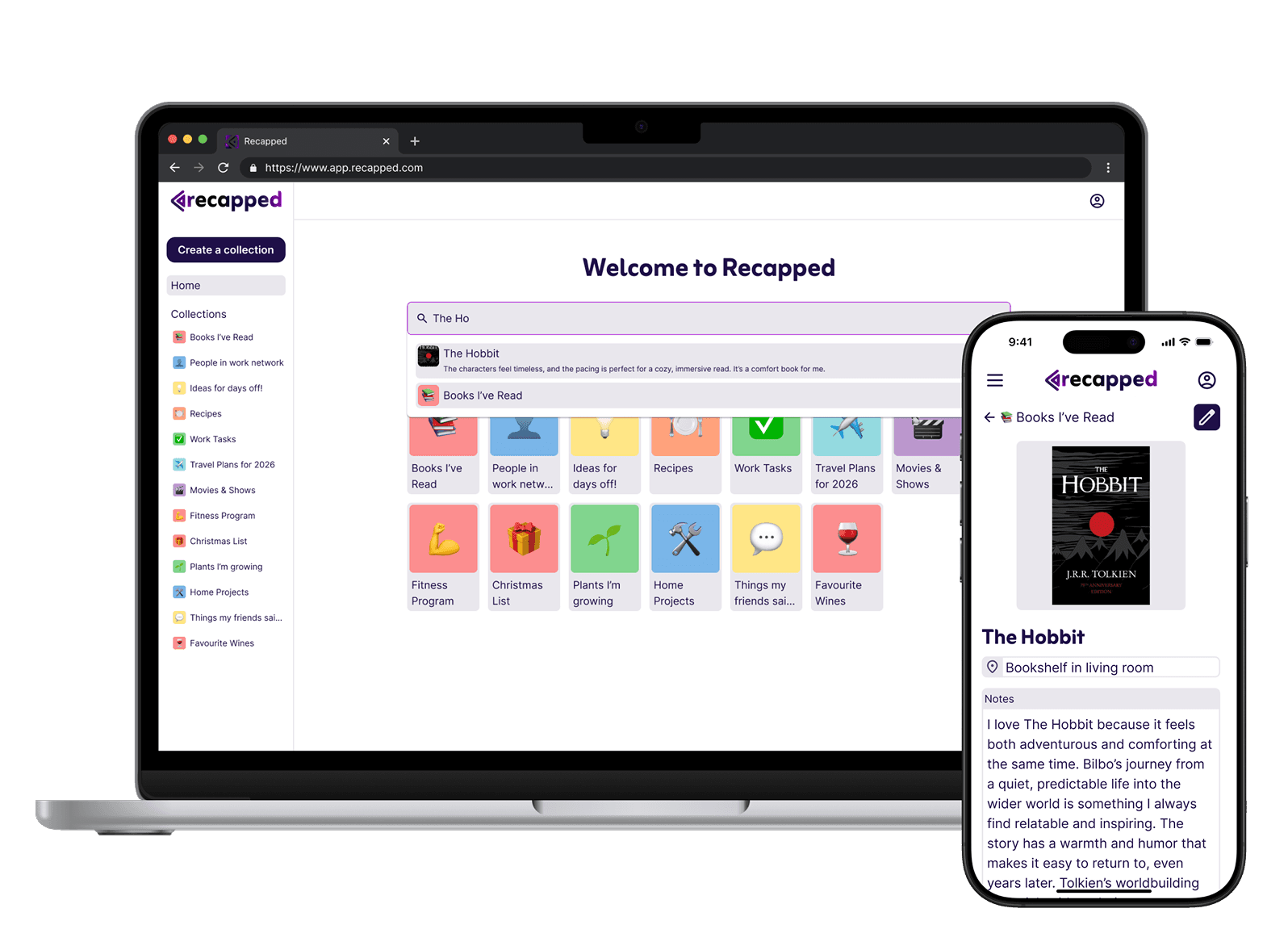
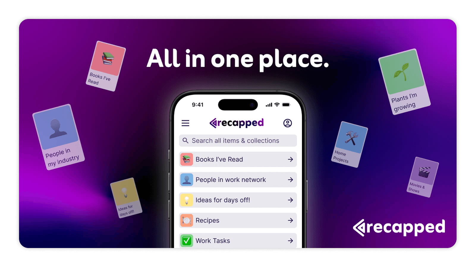
I wanted Recapped to feel personal without asking much effort from the user, so customisation is controlled and simple. A small colour palette lets people build a colour association with each collection. An emoji for each collection helps them see what it holds at a glance and makes the collections page livelier.
Plans and limits
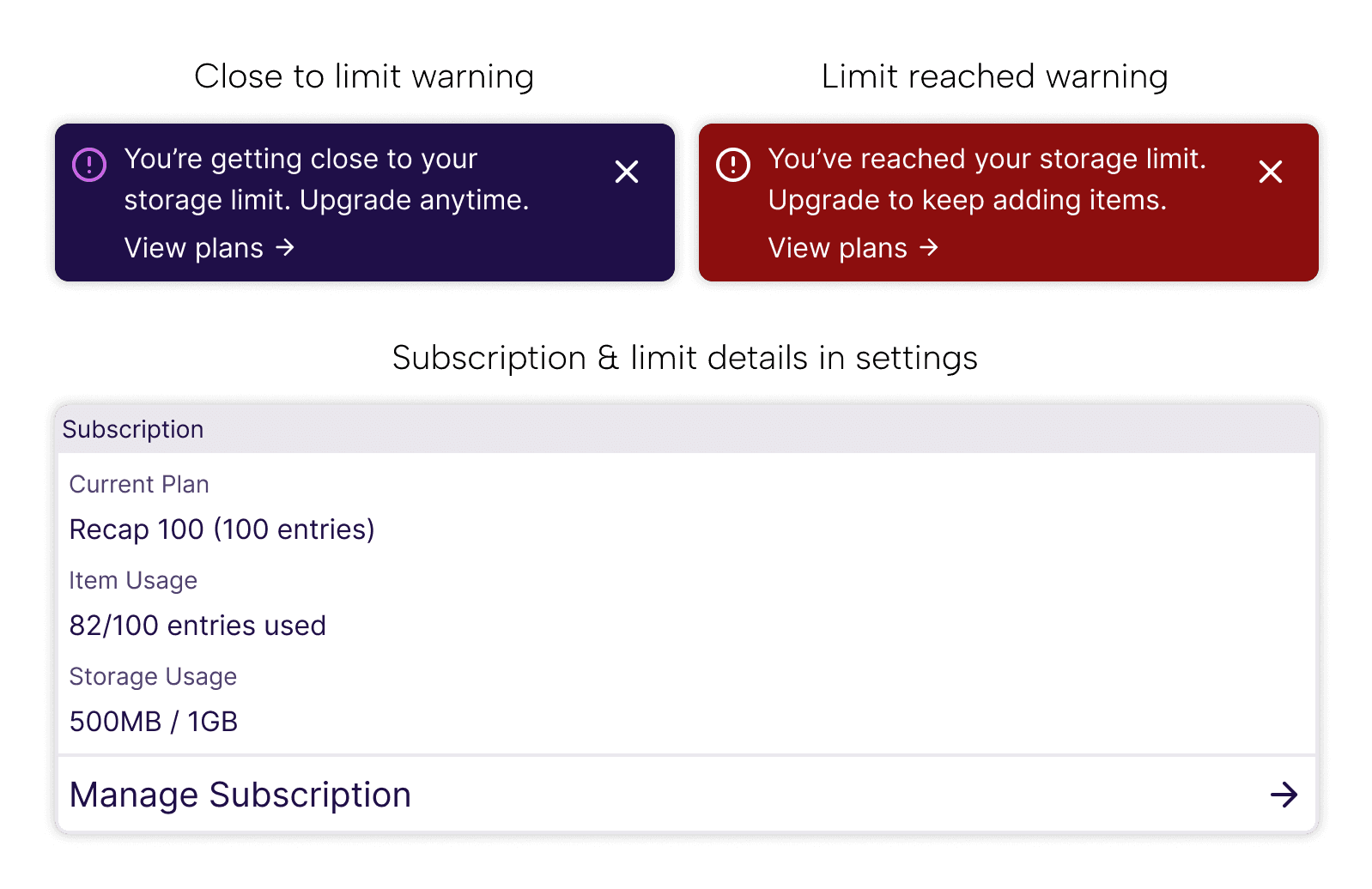
Each plan has two limits: a number of entries and an amount of storage for images. Sean and I came up with the limits together, because limiting both keeps database costs under control. The Recap 100 plan, for example, includes 100 entries and 1GB of storage.
People need to know where they stand, so the settings screen shows a Subscription card with the current plan, entries used and storage used, and a Manage Subscription link. When someone gets close to a limit, a warning tells them, and a different state shows when they've reached it.
Naming and branding
For a while we called the product "Remember App". We worked on the name together and landed on Recapped.
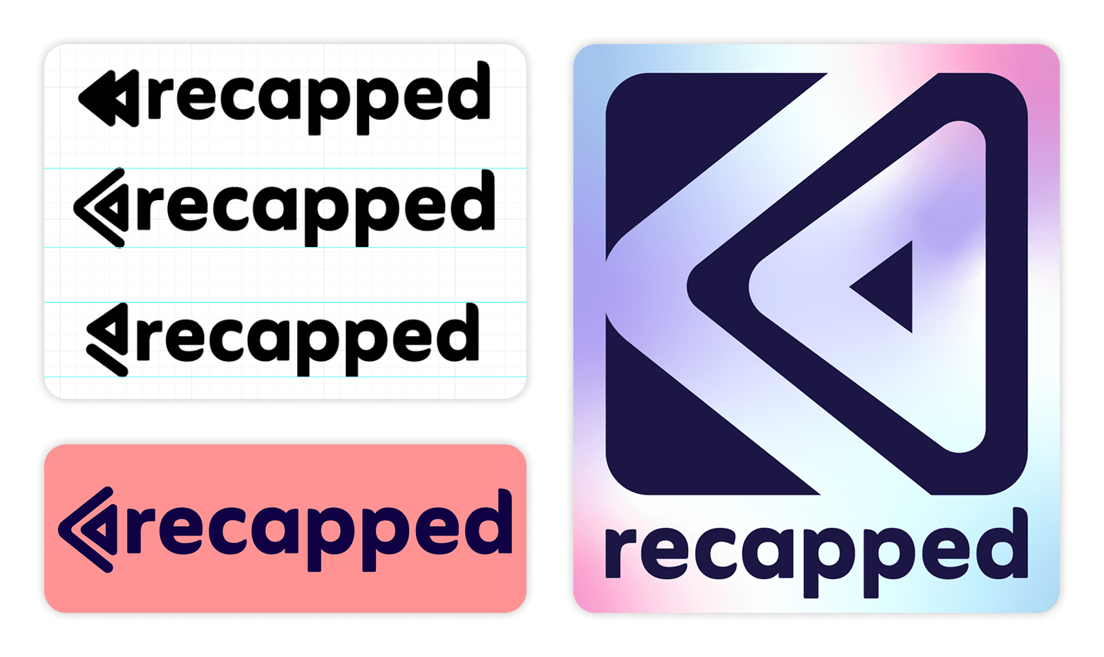
Sean and I worked in a tight feedback loop on the brand, with his input early and often to keep things moving. We decided in order: font, general logo direction, colour, then gradient. I wanted to work with purple and Sean wanted pink and blue. Purple sits between the two, so the final gradient blends pink and blue into a purple that works for both of us.
The design system
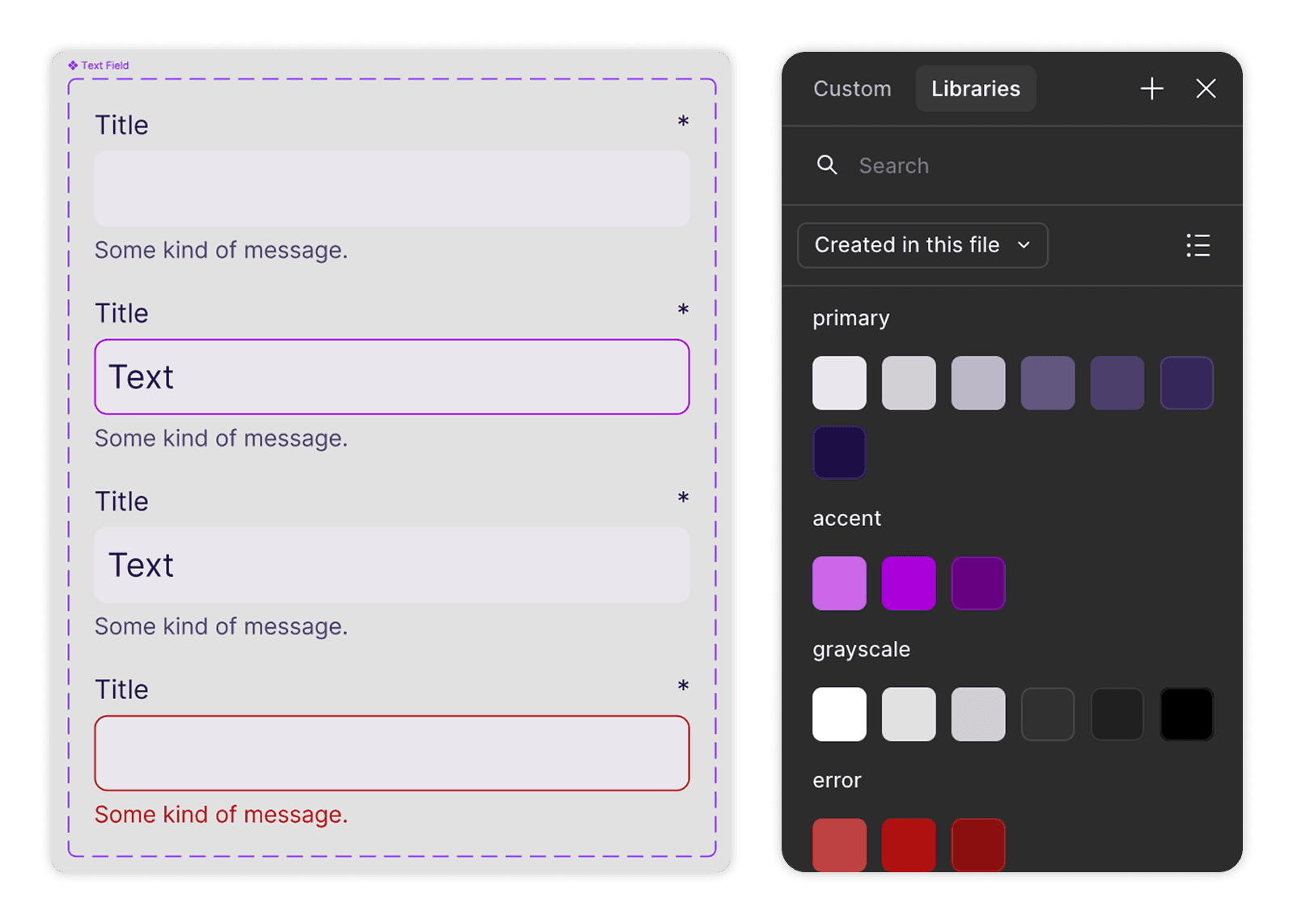
The design system is built from components, and each one is made for reuse in future features. The file starts with a Foundation page, then Components, then the hi-fi screens, with the process work (ideation and wireframes) kept in its own section. Colours are grouped into primary, accent, grayscale and error. Text styles run from H1 to P3, with separate mobile sizes for the headings, so the type scales between desktop and phone. Components are marked Ready for dev, and our developer built from them. States such as the storage warning (Almost Full and Full) are built as variants, because each plan has a storage limit and people need to see it coming. It supports any collection whose items fit the simple data structure, so the product can grow without a redesign.
Build and QA
Our developer built Recapped. We tested it internally, and I ran QA afterwards. QA caught a few small UI issues, including some in the navigation and in the homepage background.
What it became
Recapped is live at recapped.com.au. Some AI features have been added since my original design. That work sits outside this case study.
What I'd do differently
At the start I was working from Sean's brainstorm, which was broader than the version we built. It took a little while to agree what the first version included. Next time I would write the scope down together in the first conversation.
Testing was internal. Next time I would also test with people outside our team who collect things, to see whether the simple structure fits how they think about their collections.